Peer Finance
Imagine a Reddit for money that’s healthier than Blind, powered by Plaid. Introducing Peer, the anonymous and social personal finance app for building wealth and community.

Project Details
Company
Side project!
Project Length
8 months
Team
Me (and my design friends who help edit)
Opportunity
Formalize the personal finance sharing that happens on Blind, Reddit and other forums into an experience that builds community while protecting anonymity and encouraging transparency.
Messaging and early prototyping
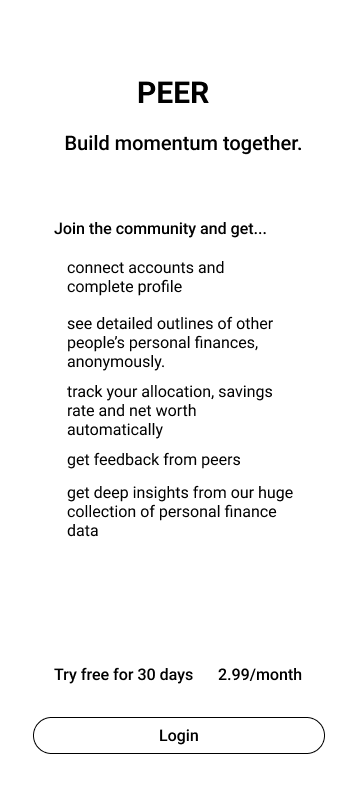
Low fidelity onboarding screen to test messaging.
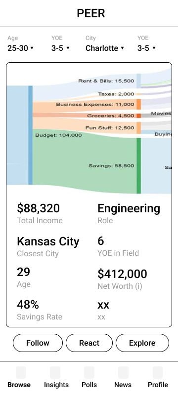
Low fidelity mocks of a user’s profile. Sankey Charts are great but the experience of interacting with them on mobile isn’t ideal
2. Innovating the full financial graph

These were attempts to allow users to compare personal accounting allocations to one another quickly and fully. All allocations are represented as a percent of total income.

This interface allows a user to simulate different reallocations for themselves OR suggest reallocations to other users.
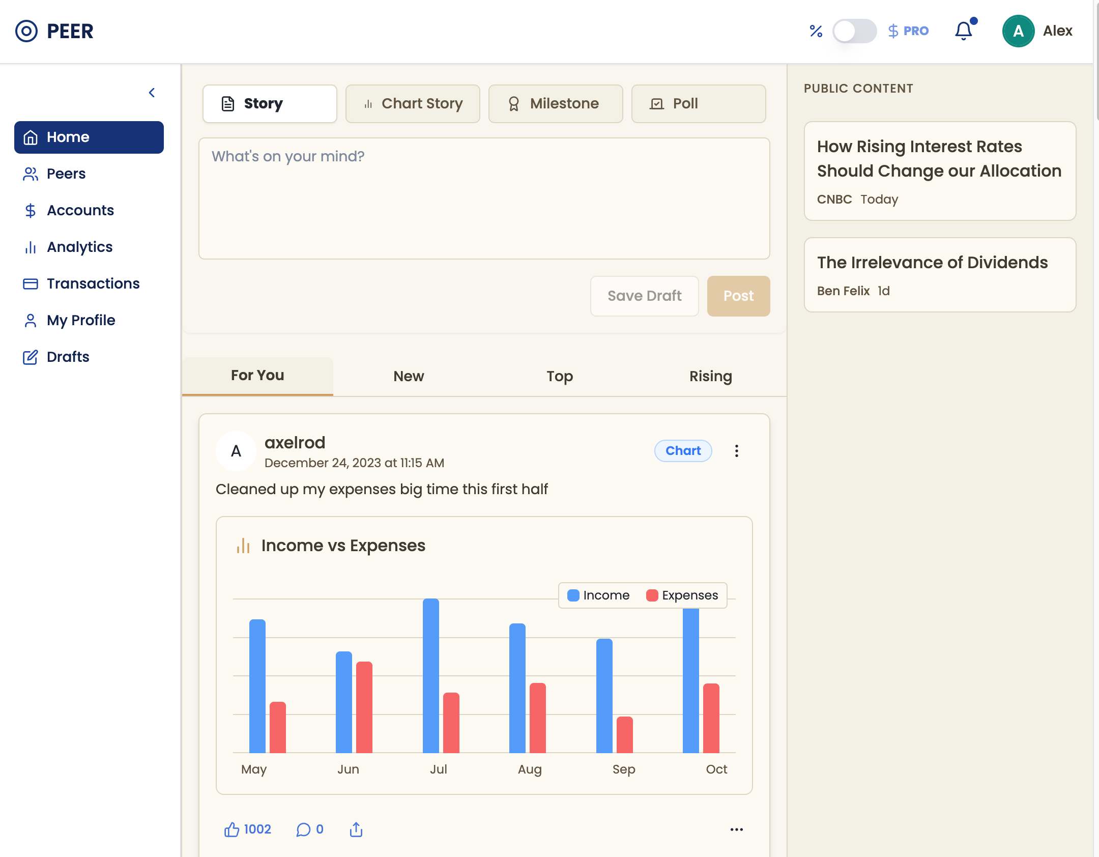
3. High fidelity explorations for main feed and profile pages
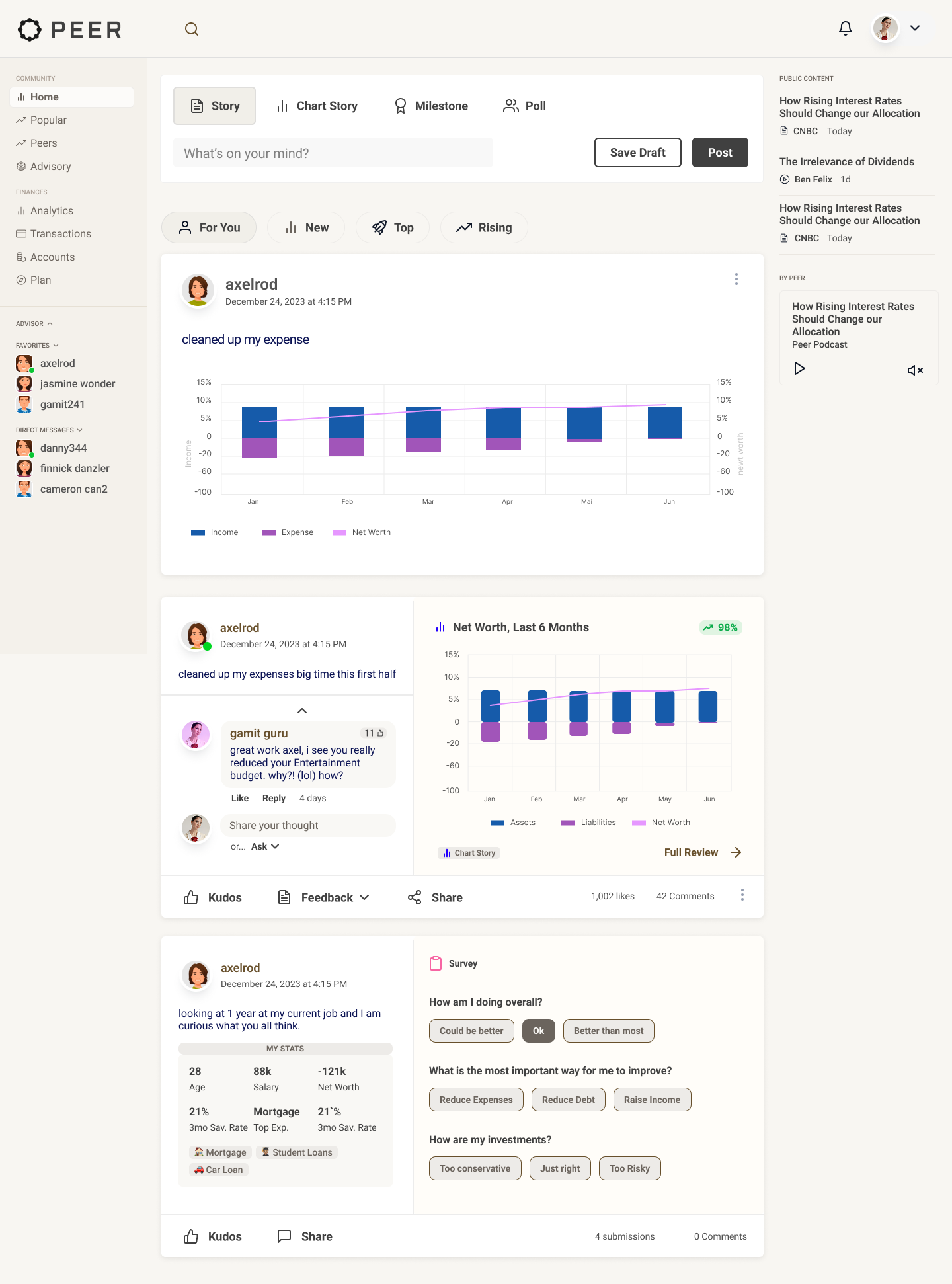
Directly inspired by our v0 prototype, I built the full experience in Figma using our design system. In this instance, I needed to extend the design system to handle a “modifier” in the top right corner of our BigRadio buttons.
For a previous mailer project we had already built an artwork upload page that included aspect ratio and file size validation in addition to a static Mailing Panel to ensure users knew which side would receive the recipients address.
4. Innovate the “posting” experience to support personal finance stories.
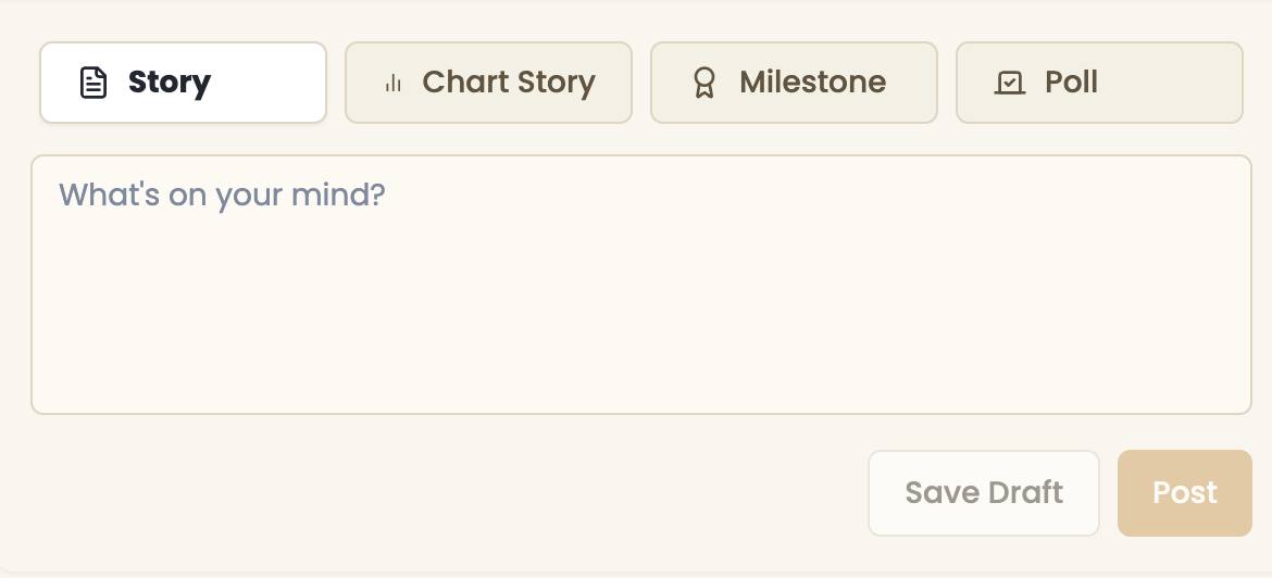
Open text to share triumphs, questions, challenges or inspiration.
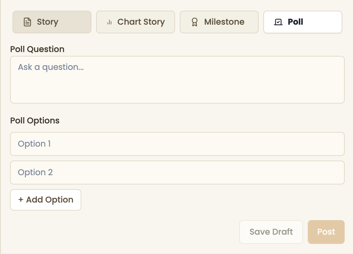
Poll the Peer community. A quick way to get consensus on a tricky situation like alimony, investment allocations, or car loans.


Open text accompanied by some relevant chart.

A purpose-built way to share an achievement with your community.

5. v0 prototyping to build navigation and test monetization experiences
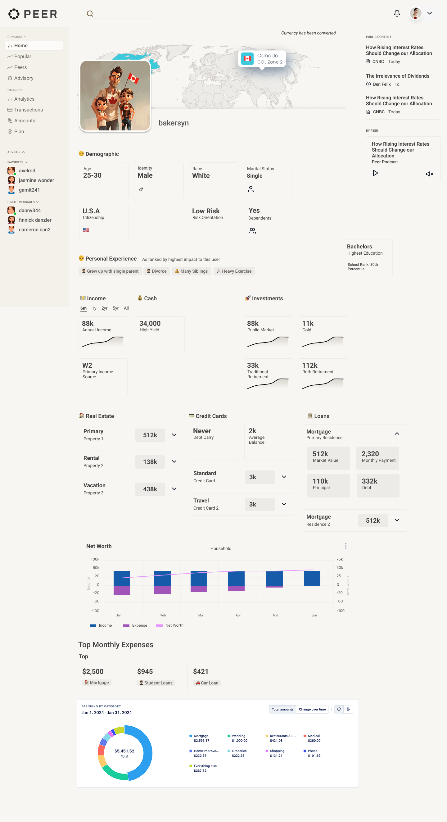
v0 allows me to quickly build site architecture and test out the placement of elements like the Upgrade to Pro feature. Pro users see absolute dollar amounts while free users see all monies as a percent of a users total income.
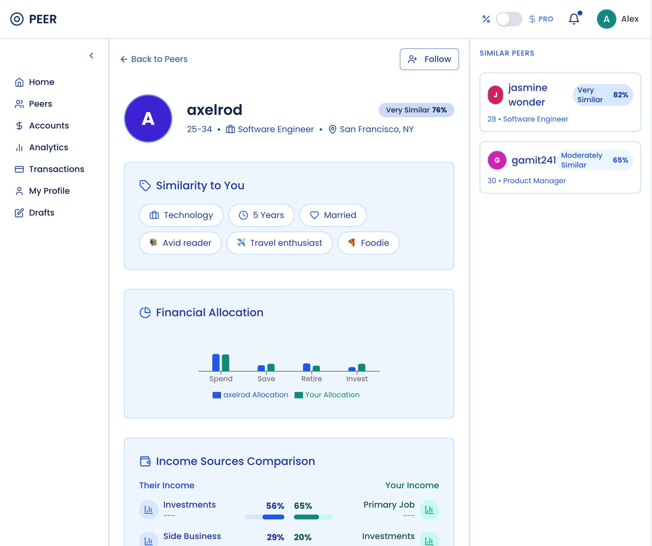
A users profile page is meant to provide context quickly. Peer is based on the ability to filter to your peer group and then peer inside their up to date finances anonymously.
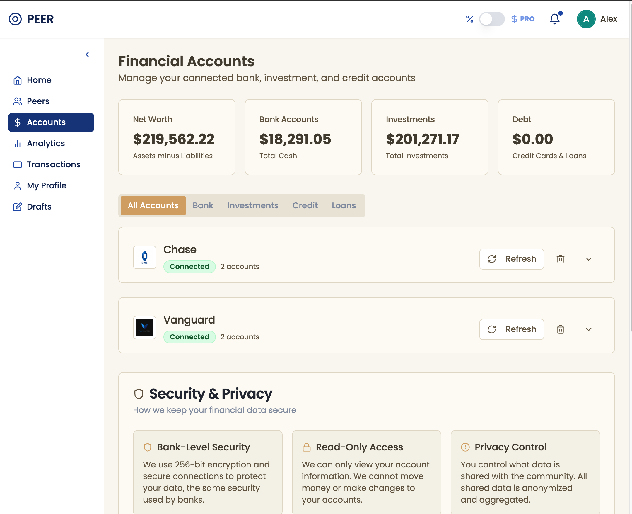
Through qualitative research, I knew that account management (during onboarding or after) needed to communicate trust to the large cohort of people still have not encountered account aggregators like Plaid.
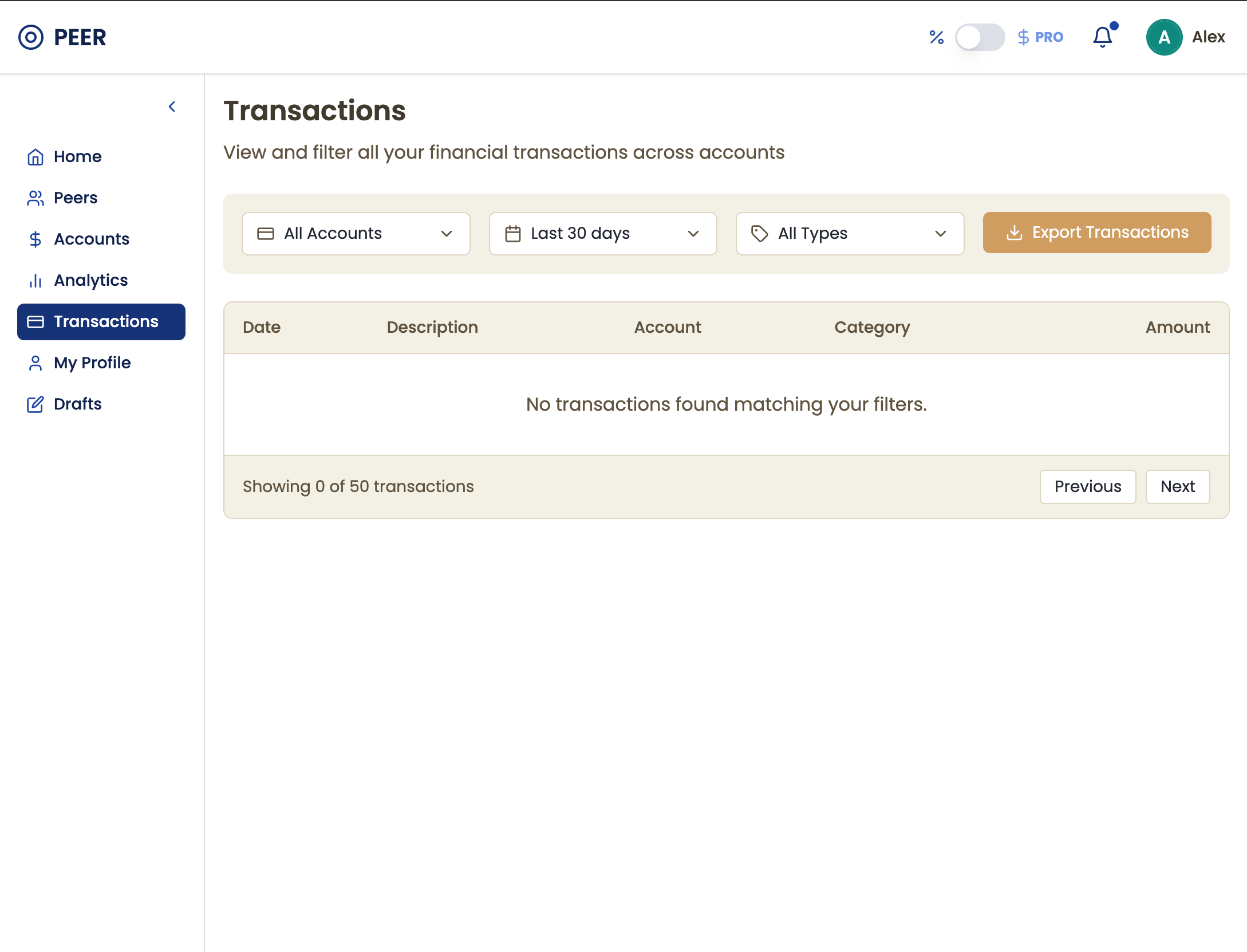
Transaction management is intended to be standard and to simply confirm that transactions are indeed coming through and being categorized accurately.
What’s next
Continue building out the v0 prototype and doing usability testing with the profile pages. Profile pages today are still too complex for mobile interfaces and it remains to be seen if folks will trust this platform to keep their finances anonymous.