Passport’s Design System
Full design system build out for Passport’s Client Portal, a tool for municipalities to manager their entire parking operation.
Project Details
Company
Passport Labs, Inc.
Project Length
3 months
Team
Miranda Bradshaw (Product Manager)
Taras Kril (Engineer)
Kevin Huff (Design Leader)
My Role
Led the definition and innovation of a design system for the existing product. Because there was was no code-based design system in place, getting one adopted by the organization (which we did!) was also my goal.
Challenge
Uncover all the components currently in use, innovate those designs slightly without making the new design components stand out. Fill in existing gaps
Develop patterns and larger page templates with documentation.
Get the organization to agree to build a design system in the code base.
The Process
Audit what exists and sell the effort to the business
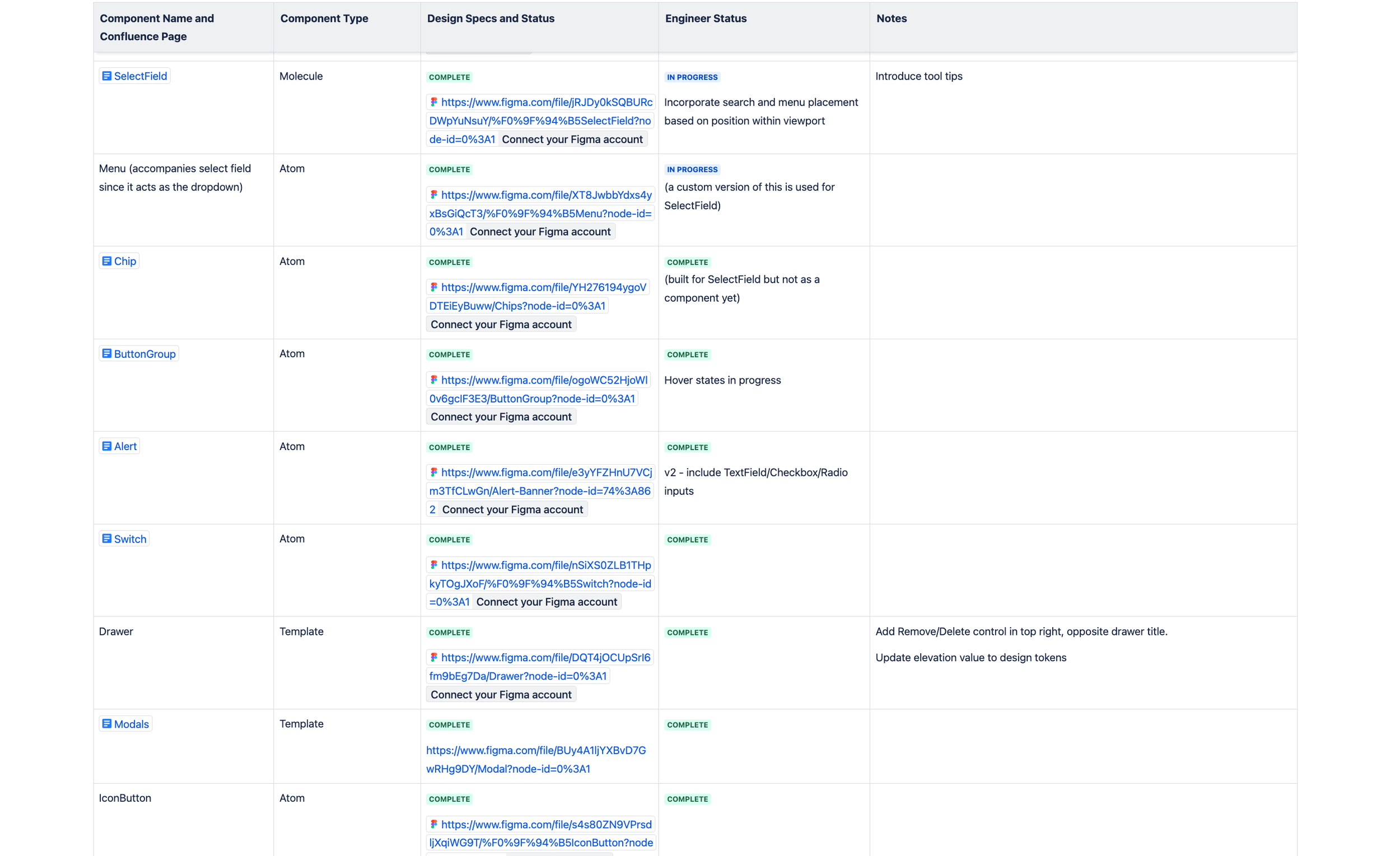
To capture all the existing components, and all their inconsistent variations, I went through the entire site taking screenshots and inspecting elements when necessary.
I created a deck explaining the company’s design system—its current state, future vision, and benefits (consistency, accuracy, accessibility, speed). It educated the team on what a design system is and built consensus to invest in it..
2. Define and build atoms, then larger components

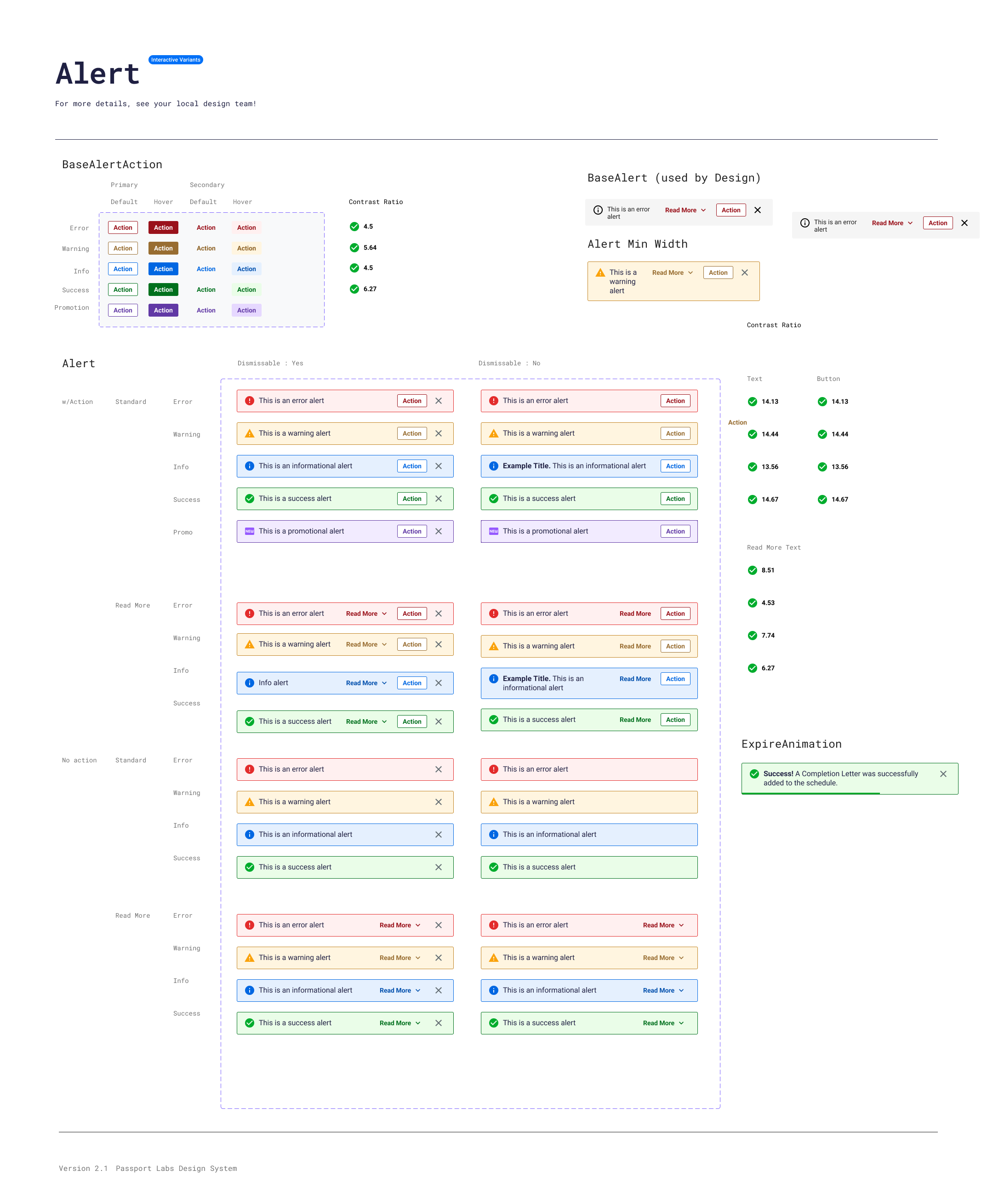
I cataloged all button types, mapped variants, checked accessibility, and set rules for borders, shadows, and icons. Built a full icon library and followed WCAG, iOS, and Android accessibility standards.

Typography was the most inconsistent design system component we saw in our audit and was the hardest to standardize. Any designs going forward would use the limited type styles we defined and when we found old type styles, we would flip them to the new standard (which was sometimes substantial change).
Variation 3 of the rate calendars with additional styling and controls. Some of these details were relegated to later sprints for their complexity.
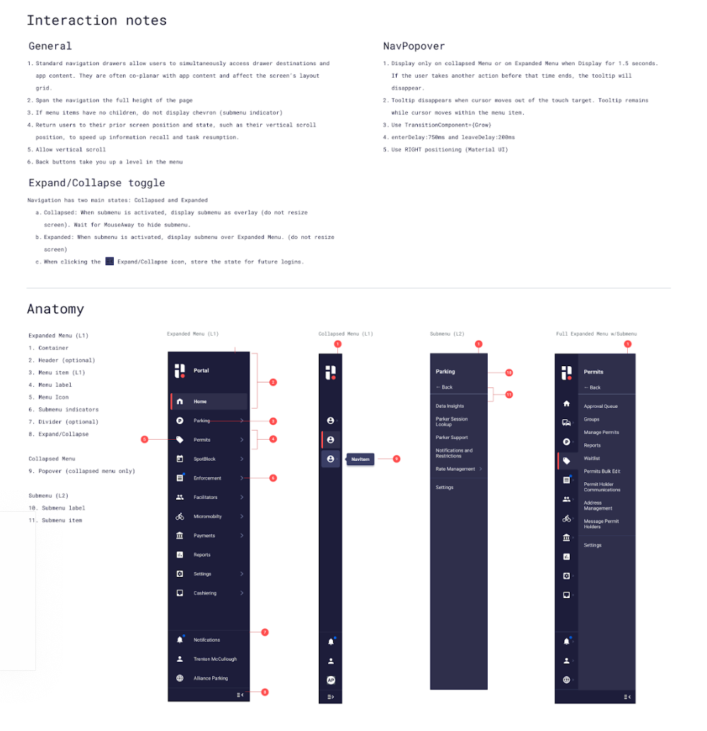
I built interaction guidelines, anatomy breakdowns, usage principles, do’s and don’ts for each atom, molecule and organism. These would eventually be ingested into Storybook for production.
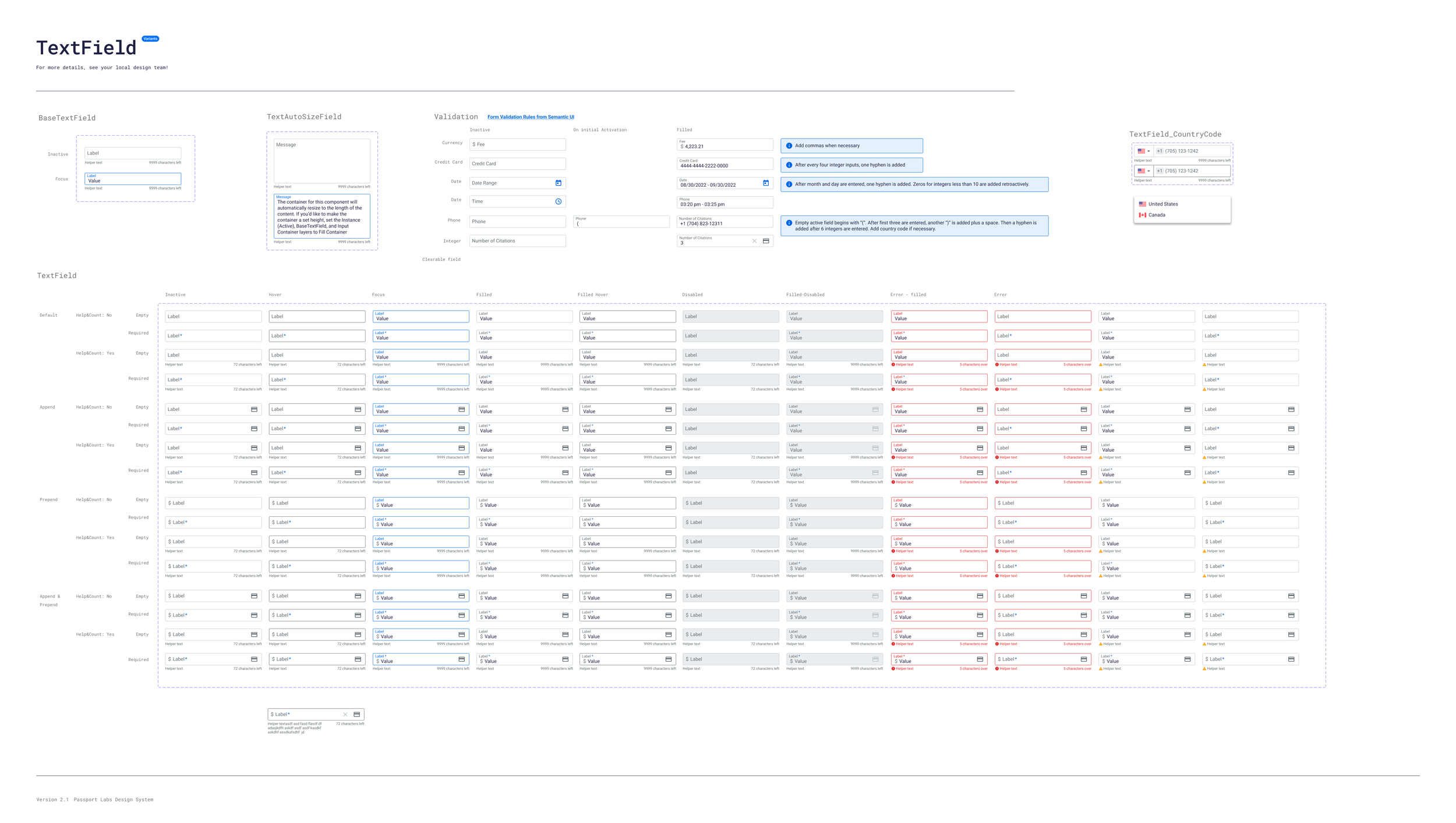
The TextField component, and its SelectField (has dropdown) variant were complex. We tried to bake in as much functionality as possible to cover all the use cases we discovered throughout the app.
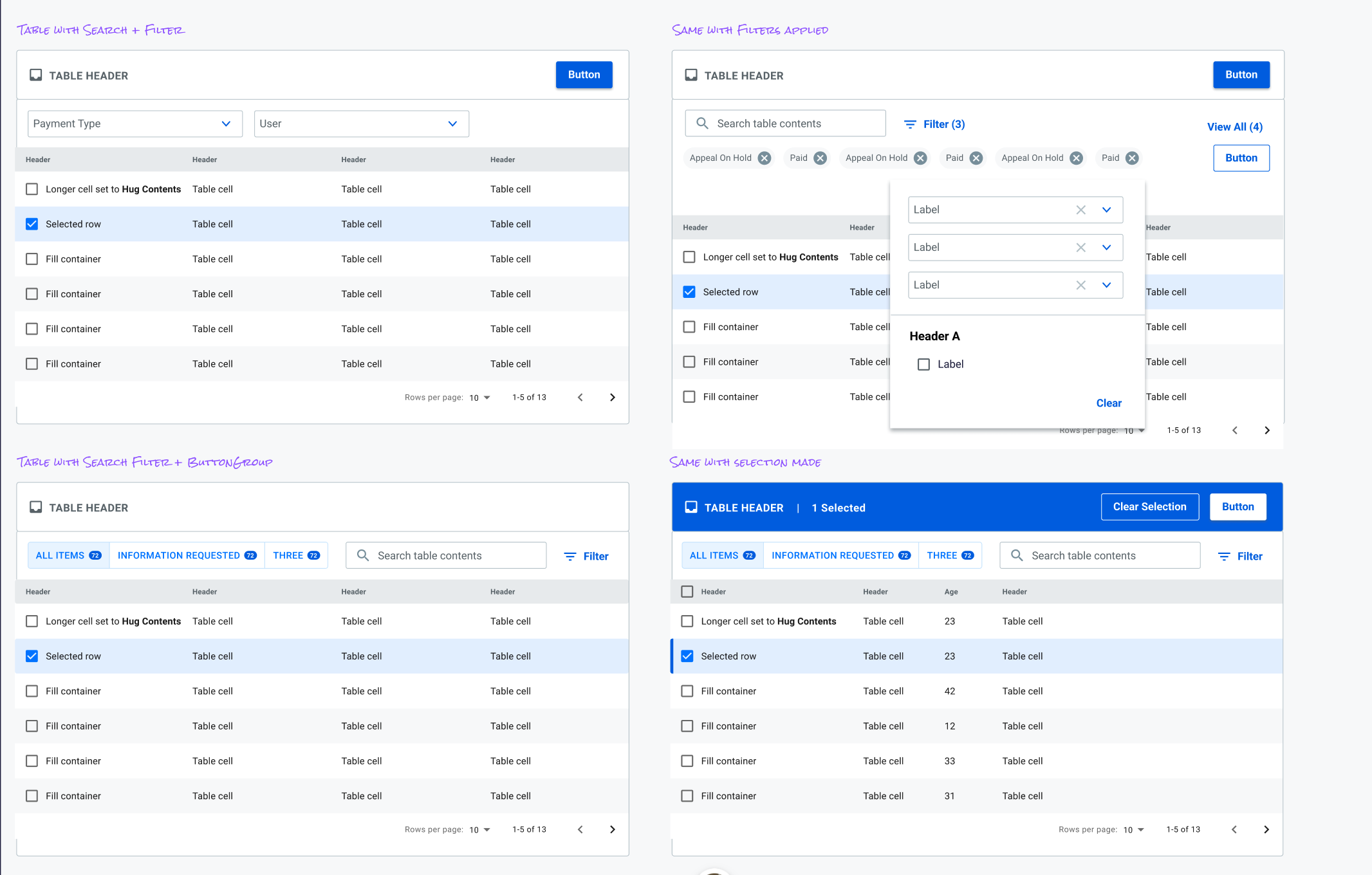
Tables were a crucial “organism” for our Client Portal and took the biggest chunk of time to standardize. The Table component would grow to include row selection, row actions, complex filters, search, and pagination. We took lots of inspiration from Material Design here.
3. Develop
The team quickly settled on a many-page flow, or wizard, to walk clients through setting up rates.

As quickly as we could we laid out most of the settings required, ordered them based on our early research, and got back in front of internal users and stakeholders. We confirmed the approach but had to make adjustments to the order. In one instance we just were placing to much on the screen at once and it slowed down multiple users.
4. Deliver
Finalize Design System Guidelines and documentations
Setup Figma Design System analytics tracking
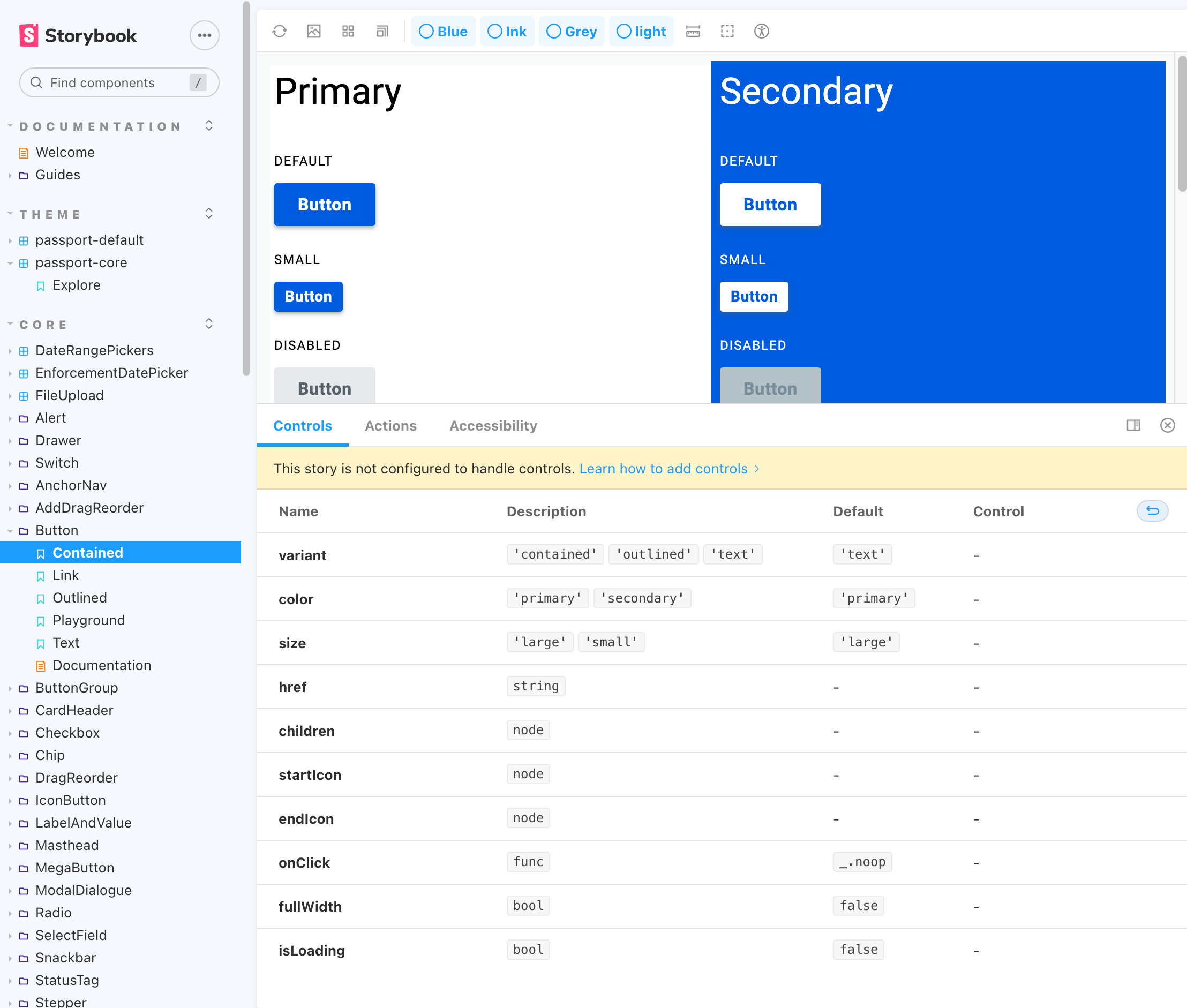
Collaboration with engineers to build documentation and previews in Storybook.
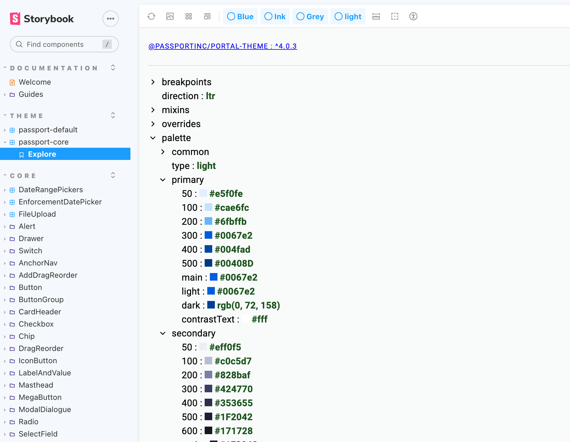
Generating global theming was a key unlock for engineers realizing the power, and ease, of using a shared design system.
Results
Successfully designed and implemented 18 (and counting) components in the code base with supporting theming
Increased time user interface consistency throughout the portal
Dramatically decreased time designing in Figma
Increased accessibility and systems thinking awareness throughout the org.
Decreased development time building pages (after initial design system investment)