Rate Management
This project created the client-managed backend that supports the city’s Passport mobile parking app.
Project Details
Company
Passport Labs, Inc.
Project Length
4 months
Team
Sam Lee (Product Owner)
Emily Stone (Product Manager)
Courtney H. (Content Strategist)
Kenny H. (Engineer)
Chris T. (Support) - he was super invaluable
Client Success
My Role
Lead product designer responsible for understanding current problems and use cases, external and internal user research, wireframing, high fidelity mockups, recommending information architecture, usability testing, and expanding our design system to accommodate the new interfaces.
Challenge
Make the internal rate management tool (where municipalities across the U.S. establish how much you’ll pay for curbside parking and for what duration) available to all of our customers.
Discover
Over the first month, I crafted an Interview Protocol. I then reached out to my teammates in Client Success, Support, and to schedule interviews with teammates familiar with the existing process and clients who hoped to benefit from the self-servicing we would be building. During this time, I collected what intel I could from clients, our competitors, and the industry about best practices for Rate Management.

Competitor review of Park Mobile’s rate management feature. At this point, we began getting the hunch a strong calendar view was going to be important. This informed early conversations with engineers.

A collection of custom tags in Dovetail used to find patterns in the interview recordings.
Define
With interviews analyzed, we set to refining our notes on features and settings into a format that would allow the content strategist and I to refine the language and sequencing of settings. In the hopes of getting a jump start with Engineering, I also made quick mockups of how we could display rates in a calendar view to get a sense of the complexity it would take to build.

A comprehensive Inventory of all the features and settings in the existing experience. The sequence these settings would display and if we would deprecate or evolve any of these settings happened in this spreadsheet.
An early concept of rates displaying in a calendar view. I tucked lots of quick ideas into this exploration to give the conversation with engineers tons to for us to feed on as we talked scoping.
Develop
At this stage, we were rapidly prototyping the sequencing with internal users and clients. The content strategist, product manager, and I continued to play with the language and the priority and the sequencing of the settings. As we became more comfortable with the overall flow we began to dive into the important calendar to display when the rates are occurring.

The team quickly settled on a many-page flow, or wizard, to walk clients through setting up rates.

As quickly as we could we laid out most of the settings required, ordered them based on our early research, and got back in front of internal users and stakeholders. We confirmed the approach but had to make adjustments to the order. In one instance we just were placing to much on the screen at once and it slowed down multiple users.

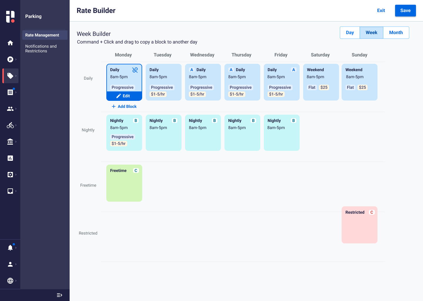
Variation 1 of rate calendar with the time of day on the y-axis. Engineers and users liked the sidebar displaying the rates but had concerned about instances where they would be 5 or more rates.
Variation 2 of rate calendar with vertical stacking of rates displaying when they are active. This format allows us to handle an infinite amount of rates with vertical scrollling.

Variation 3 of the rate calendars with additional styling and controls. Some of these details were relegated to later sprints for their complexity.
Deliver
With the confirmation of the overall flow, sequencing of settings, and the rate calendar confirmed with engineering the content strategist and I added educational carousels to kick off the experience. I then took the time to build out additional variations of overlays and flows and indicated how the flows would change based on a client’s settings and a user’s permissions.

A 3 page educational carousel for users to get themselves acquainted with the language we’ll use throughout the experience. Here we define terms like rate and rate chain and how these objects relate to each other. It was also an opportunity to bring in some warmth and style.

Here I am formalizing interactions for our design system’s table, displaying the filters our team decided on, and directing how the page level controls change given different circumstances.

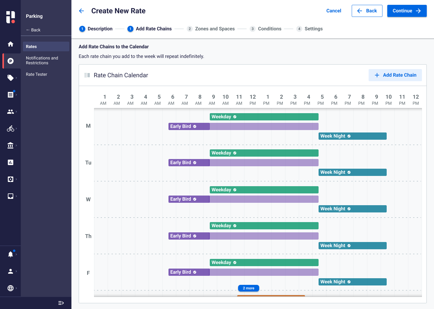
Variations of the rate calendars overlay for engineers to consider as we began tackling all of the tiny variations between client’s settings and their user’s permissions.

Rates are comprised of rate chains. This allows the rate to be very custom to the client/municipality yet it also means that our engineers really benefit from seeing out the interface changes. Here is one of the many variations of a rate chain that I built to communicate how the interface reacts to different ways the rate chains can be built by users.
Outcome
Many of the calendar components we developed we’re extended to other scheduling-based projects
This project is ongoing